


Clients:
Self-initiated
Skills:
Indesign, Illustrator, Typography
Brief:
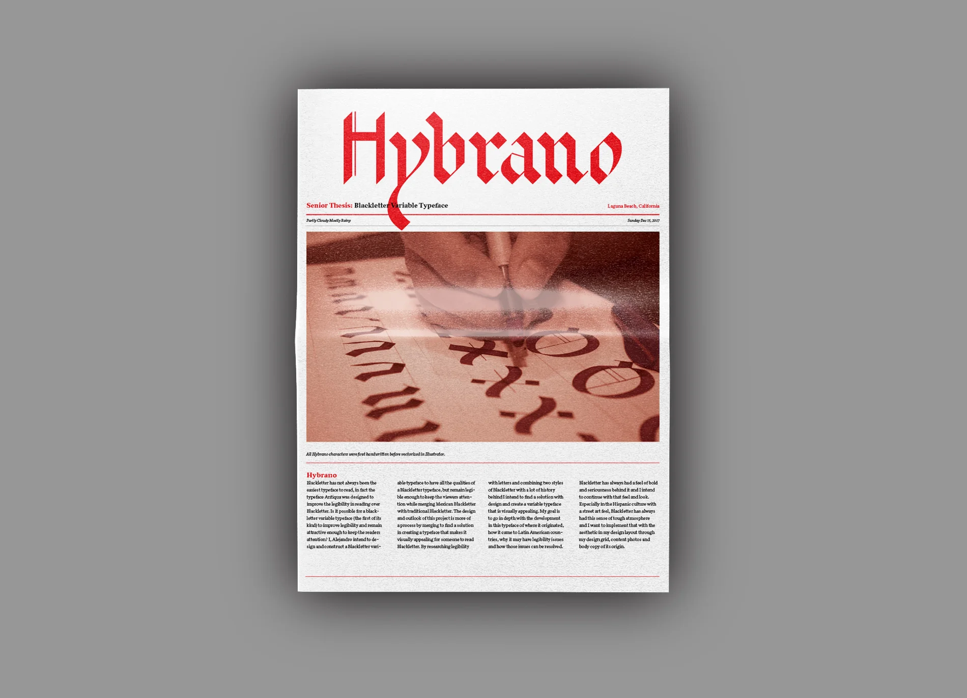
Blackletter has not always been the easiest typeface to read, in fact the typeface Antiqua was designed to improve the legibility in reading over Blackletter. Is it possible for a blackletter variable typeface (the first of its kind) to improve legibility and remain attractive enough to keep the readers attention? I, Alejandro intend to design and construct a Blackletter variable typeface to have all the qualities of a Blackletter typeface, but remain legible enough to keep the viewers attention while merging Mexican Blackletter with traditional Blackletter. The design and outlook of this project is more of a process by merging to find a solution in creating a typeface that makes it visually appealing for someone to read Blackletter. By researching legibility with letters and combining two styles of Blackletter with a lot of history behind I intend to find a solution with design and create a variable typeface that is visually appealing.